Author name: digitalperfectionist@gmail.com

Uncategorized

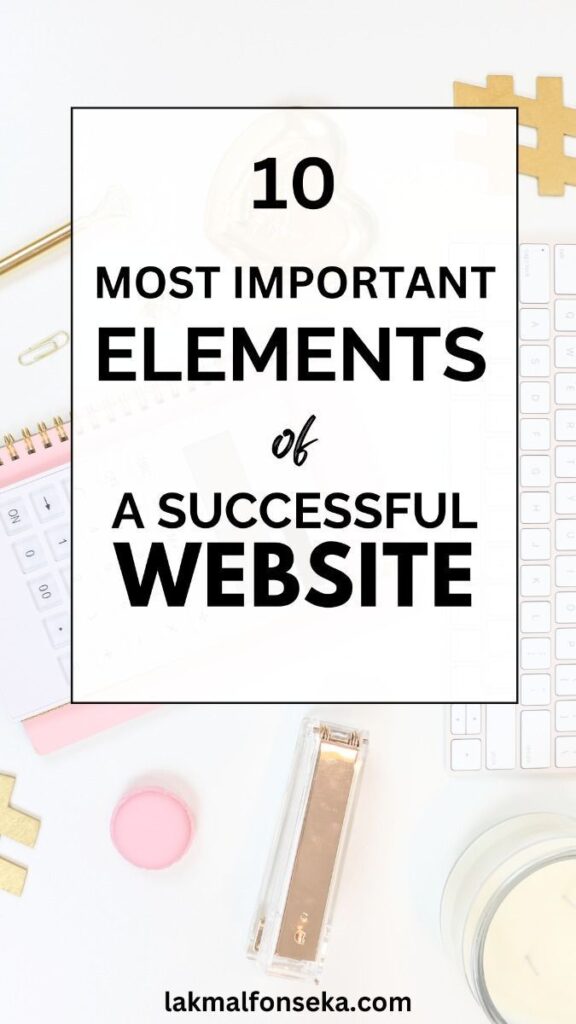
When Is It Time to Redesign Your Website?

A website is not something that should remain unchanged forever. As brands evolve, user expectations shift, and technology advances, websites can quickly become outdated. Knowing when it’s time to redesign your website is essential for maintaining a strong, effective online presence. A redesign is not always about starting over—it’s often about refining, improving, and realigning a website with current goals and user needs. Your Website Looks Outdated Design trends and standards change over time. A website that once felt modern can begin to look old-fashioned, especially when compared to competitors. Signs your website may look outdated include: An outdated appearance can negatively affect credibility, even if the content itself is still relevant. Poor User Experience and Navigation If visitors struggle to find information or navigate your site easily, it may be time for a redesign. User expectations are higher than ever, and confusing layouts or unclear navigation can quickly lead to frustration. Common UX issues include: A redesign focused on user experience can dramatically improve usability and engagement. Your Website Is Not Mobile-Friendly With the majority of users browsing on mobile devices, a website that does not perform well on smaller screens is at a serious disadvantage. If your website: then a redesign with a mobile-first approach is essential. Your Brand or Business Has Changed As businesses grow and evolve, their websites should reflect those changes. New services, updated messaging, or a refined brand identity may no longer align with an older website design. A redesign allows you to: Your website should represent where your brand is now, not where it used to be. Low Engagement or Conversion Rates If your website receives traffic but does not encourage action, it may not be effectively supporting your goals. Low engagement, short visit durations, or lack of inquiries can signal design or UX issues. A thoughtful redesign can: Design plays a significant role in how users interact with a website. Difficulty Updating or Managing Content Websites that are hard to maintain often fall behind. If updating content feels complicated or time-consuming, it may be time to rethink the structure and design. A redesign can help: This ensures your website can grow and adapt over time. Final Thoughts Redesigning a website is not just about aesthetics—it’s about improving usability, performance, and alignment with current goals. When a website no longer serves its purpose effectively, a redesign becomes an opportunity to enhance both form and function. By recognizing the signs early, businesses can invest in a redesign that strengthens their online presence and supports long-term success. Thinking about redesigning your website? I’d be happy to help you create a modern, user-focused design—feel free to get in touch.

Uncategorized

How Design Consistency Strengthens Brand Identity

Brand identity is more than a logo or a color palette. It is the overall impression a brand leaves across every interaction. In digital spaces, design consistency plays a critical role in shaping that impression and building recognition, trust, and credibility. When design elements work together consistently, a website becomes a strong and cohesive representation of a brand. What Is Design Consistency? Design consistency refers to the intentional and uniform use of visual and structural elements across a website. This includes typography, color, spacing, layout, and overall style. Consistent design ensures that all pages feel connected and aligned with the same brand message. It creates a sense of order and familiarity, helping users understand and trust what they are interacting with. Consistency Builds Brand Recognition One of the most important benefits of design consistency is recognition. When users repeatedly see the same colors, fonts, and layout patterns, they begin to associate those elements with a specific brand. Over time, this familiarity: A consistent visual identity helps a brand stand out in a crowded digital space. Trust Is Built Through Visual Reliability Consistency communicates professionalism. When a website maintains the same visual language throughout, it signals attention to detail and reliability. Inconsistent design—such as changing fonts, colors, or layouts from page to page—can feel disorganized and may cause users to question the credibility of the brand. Reliable design creates a sense of stability that encourages users to engage with confidence. Design Consistency Improves User Experience Consistency helps users navigate a website more easily. When elements such as buttons, navigation menus, and headings behave the same way across pages, users know what to expect. This reduces cognitive effort and allows users to focus on content rather than figuring out how the website works. Good user experience is supported by predictable and familiar design patterns. Strong Visual Hierarchy Supports Clear Messaging Design consistency also reinforces visual hierarchy. When headings, body text, and calls to action follow a consistent structure, users can quickly identify what is important. Consistent hierarchy: This helps brands communicate their message clearly and effectively. Consistency Across Devices Strengthens the Brand A brand’s identity should remain recognizable across all devices. Responsive and mobile-first design should maintain consistent colors, typography, and layout principles, even as the structure adapts to different screen sizes. When users experience the same brand identity on mobile, tablet, and desktop, the brand feels more unified and trustworthy. Consistent Design Supports Long-Term Growth Consistency creates a strong foundation for growth. As a brand expands its website or adds new content, a clear and consistent design system makes it easier to scale without losing identity. A well-defined visual system allows: Consistency ensures that growth does not dilute the brand’s message. Design consistency is a powerful tool in building and strengthening brand identity. Through intentional use of visual elements and structure, brands can create recognizable, trustworthy, and meaningful digital experiences. When design remains consistent, a website becomes more than a collection of pages—it becomes a cohesive expression of the brand itself.

Uncategorized

Responsive Design: Why Mobile-First Matters

The way people access websites has changed significantly. Today, a large percentage of users browse the internet on mobile devices, making responsive design a fundamental requirement rather than an optional feature. A website that does not perform well on smaller screens risks losing visitors before they even engage with the content. Mobile-first design places the user at the center of the experience by prioritizing functionality, readability, and accessibility across all devices. What Is Responsive and Mobile-First Design? Responsive design allows a website to adapt seamlessly to different screen sizes and devices. Mobile-first design takes this concept a step further by designing for smaller screens first, then scaling the design up for larger devices. Instead of shrinking a desktop layout to fit a phone, mobile-first design ensures that the core content and functionality work perfectly on mobile before being enhanced for tablets and desktops. Mobile-First Reflects How Users Browse Today Most users now access websites from their phones. They expect fast load times, readable content, and intuitive navigation regardless of screen size. Designing mobile-first ensures that: By focusing on mobile users first, designers create experiences that align with real user behavior. Improved Usability Across All Devices Mobile-first design encourages simplicity and clarity. Limited screen space forces designers to focus on what truly matters, resulting in cleaner layouts and more intentional design decisions. This approach often leads to: When a design works well on mobile, it typically performs even better on larger screens. Better Performance and Faster Load Times Mobile-first design often results in lighter, more efficient websites. By prioritizing essential elements and optimizing assets early, websites load faster and perform more smoothly. Faster websites: Performance is a critical part of responsive design and should be considered from the beginning. Consistency and Accessibility Responsive, mobile-first websites provide a consistent experience across devices. Users should be able to switch from phone to tablet to desktop without confusion or loss of functionality. Mobile-first design also improves accessibility by: Consistency builds trust and makes websites feel more reliable. Mobile-First Design Supports Business Goals A website designed with mobile users in mind is more likely to achieve its goals. Whether the objective is to generate leads, encourage contact, or share information, mobile-first design helps remove barriers that could prevent users from taking action. When users can easily interact with a website on any device, engagement and conversions are more likely to increase. Final Thoughts Responsive design is no longer optional, and mobile-first thinking has become essential. By designing for mobile first, designers create websites that are clear, efficient, and user-focused from the start. Mobile-first design leads to better usability, stronger performance, and more meaningful digital experiences. In a world where users expect accessibility everywhere, responsive design ensures that websites meet those expectations with confidence.

Uncategorized

The Importance of User Experience in Website Design

Website design is often associated with visual appeal, but the true success of a website goes far beyond how it looks. User experience (UX) focuses on how a website feels to use—how easily visitors can navigate it, understand it, and interact with its content. A well-designed user experience ensures that a website is not only attractive, but also intuitive, accessible, and effective. What Is User Experience in Website Design? User experience refers to the overall interaction a user has with a website. It includes every step of the journey, from the moment a visitor lands on a page to the actions they take while navigating through the site. UX design considers factors such as: When UX is thoughtfully designed, users can move through a website naturally without confusion or frustration. UX Helps Users Find What They Need One of the main goals of user experience design is to make information easy to find. Visitors should not have to search excessively or guess where content is located. Good UX design achieves this by: When users can quickly find what they are looking for, they are more likely to stay engaged and explore further. User Experience Builds Trust and Credibility A smooth and intuitive experience creates a sense of professionalism and reliability. When a website functions well and feels easy to use, users are more likely to trust the brand behind it. Poor UX—such as broken links, confusing layouts, or inconsistent design—can lead users to question the credibility of a website, even if the content itself is strong. Trust is built through thoughtful design choices that prioritize the user’s needs. UX Improves Engagement and Retention Websites with good user experience encourage users to stay longer and interact more. Clear navigation, readable content, and intuitive interactions help reduce friction and keep users engaged. When users enjoy their experience, they are more likely to: User experience directly influences how long visitors stay and how they interact with a website. Mobile Experience Is a Key Part of UX With a large percentage of users browsing on mobile devices, UX design must account for different screen sizes and interaction methods. Mobile-friendly UX includes: A strong mobile experience ensures accessibility and consistency, regardless of the device being used. UX Supports Clear Communication User experience design plays a major role in how information is communicated. Visual hierarchy, spacing, and layout help guide users’ attention and make content easier to understand. Effective UX design: This allows users to absorb information efficiently without feeling overwhelmed. User Experience Impacts Website Performance Good user experience supports meaningful outcomes. Whether the goal is to encourage contact, showcase work, or provide information, UX design influences how users respond. A well-designed UX can: UX is not an optional enhancement—it is a core component of a website’s success. Final Thoughts User experience is at the heart of effective website design. A website that prioritizes UX feels intuitive, accessible, and purposeful. By focusing on clarity, usability, and thoughtful interaction, designers can create websites that truly serve their users. When user experience is designed with intention, a website becomes more than a visual space—it becomes a meaningful and effective digital experience.

Uncategorized

Common Website Design Mistakes and How to Avoid Them

A well-designed website should feel clear, intuitive, and intentional. However, many websites struggle not because of a lack of effort, but due to common design mistakes that negatively affect usability and perception. These issues can prevent visitors from engaging, understanding the message, or taking action. Identifying and avoiding these mistakes is key to creating a website that performs effectively and leaves a positive impression. 1. Cluttered Layouts and Too Much Content One of the most common website design mistakes is overcrowding pages with too many elements. When everything competes for attention, users can feel overwhelmed and unsure where to focus. How to avoid it: A clean layout improves readability and helps users engage more naturally with the content. 2. Unclear Navigation Structure If users cannot easily find what they are looking for, they are likely to leave. Complex or confusing navigation creates frustration and disrupts the user experience. How to avoid it: Clear navigation helps users move through the website with confidence. 3. Poor Typography Choices Typography has a major impact on readability and visual consistency. Using too many fonts or poorly chosen typefaces can make a website feel unprofessional and difficult to read. How to avoid it: Good typography enhances clarity and strengthens overall design quality. 4. Ignoring Mobile Responsiveness A website that looks good on desktop but performs poorly on mobile creates a negative experience for a large portion of users. Non-responsive designs often lead to unreadable text and awkward layouts. How to avoid it: Responsive design ensures accessibility and usability across all devices. 5. Inconsistent Design Elements Inconsistency in colors, fonts, spacing, or layout can confuse users and weaken brand identity. Professional websites maintain visual harmony throughout every page. How to avoid it: Consistency builds trust and creates a polished appearance. 6. Weak or Missing Calls to Action Without clear calls to action, users may not know what to do next. This can lead to missed opportunities for engagement or conversion. How to avoid it: Effective calls to action guide users toward meaningful interaction. 7. Slow Load Times Heavy images, unoptimized assets, and unnecessary effects can slow down a website. Slow load times often cause users to leave before engaging with the content. How to avoid it: Fast-loading websites improve user satisfaction and retention. Final Thoughts Avoiding common website design mistakes is essential for creating a professional and effective digital presence. By focusing on clarity, usability, consistency, and performance, designers and businesses can create websites that feel intuitive and trustworthy. Thoughtful design choices not only improve user experience but also help websites achieve their goals more effectively. Need help improving or redesigning your website? I’m happy to help—feel free to get in touch.

Uncategorized

Key Elements Every Professional Website Should Have

A professional website is more than a visually appealing layout. It is a carefully structured digital space designed to communicate clearly, guide users, and represent a brand with credibility. While design trends change over time, the core elements of a strong website remain consistent. Understanding these essential elements helps ensure that a website not only looks good, but also works effectively for both users and business goals. Clear Purpose and Direction Every professional website should have a clear purpose. Within a few seconds of landing on the site, visitors should understand what the brand offers and what action they are encouraged to take. A strong website clearly answers: Design, content, and layout should all support this purpose without confusion or unnecessary distraction. Clean and Organized Layout Layout plays a major role in how users interact with a website. A clean and well-structured layout helps guide attention and improves readability. Professional layouts typically include: Cluttered or overcrowded designs can overwhelm users and make information difficult to process. Simplicity and structure help users focus on what matters most. Easy and Intuitive Navigation Navigation is one of the most important usability elements of a website. Visitors should be able to move through the site naturally without having to think too hard. Effective navigation includes: When users can find what they need quickly, they are more likely to stay longer and explore further. Strong Visual Hierarchy Visual hierarchy helps users understand which elements are most important on a page. Through size, contrast, spacing, and typography, design can guide users’ eyes in a natural order. A good visual hierarchy: This allows users to absorb information efficiently, especially when browsing quickly. Consistent Typography and Colors Consistency in typography and color use creates a polished and trustworthy appearance. Professional websites use a limited set of fonts and colors that align with the brand’s identity. Consistency helps: Random font changes or excessive color use can make a website feel unstructured and unprofessional. Responsive and Mobile-Friendly Design A professional website must function well across all devices. Responsive design ensures that content adapts smoothly to different screen sizes, from desktops to smartphones. Mobile-friendly design improves: With many users browsing on mobile devices, this element is no longer optional—it is essential. High-Quality Content Presentation Good content deserves good presentation. Professional websites present content in a way that is easy to read and visually balanced. This includes: Well-presented content improves engagement and makes information more approachable. Clear Calls to Action Every professional website should guide users toward meaningful actions. Whether it’s contacting a business, viewing a portfolio, or learning more, calls to action should be clear and visible. Effective calls to action: They help convert visitors into engaged users or potential clients. Final Thoughts A professional website is built on clarity, consistency, and usability. By focusing on clean layouts, intuitive navigation, responsive design, and thoughtful content presentation, a website can effectively communicate its message and build trust with users. When all these elements work together, the result is a website that feels intentional, credible, and capable of supporting long-term goals. Looking to build or improve a professional website with clarity and purpose? Let’s work together.

Uncategorized

Why Good Website Design Matters More Than Ever

In today’s digital world, a website is often the first point of contact between a brand and its audience. Before a conversation happens, before trust is built, and before a decision is made, users interact with a website. This makes website design more important than ever—not just visually, but strategically. Good website design goes beyond appearance. It shapes perception, influences behavior, and directly affects how users engage with a brand. First Impressions Happen Fast Studies consistently show that users form an opinion about a website within seconds. In that short moment, design plays a major role in determining whether visitors stay or leave. A clean layout, clear typography, and balanced spacing immediately communicate professionalism and credibility. On the other hand, cluttered layouts, inconsistent styling, or outdated visuals can quickly create doubt—even if the content itself is valuable. Good design helps users feel confident that they are in the right place. Design Builds Trust and Credibility Trust is essential online. Users are more likely to engage with a website that looks polished, organized, and intentional. Design elements such as: all contribute to a sense of reliability. When a website feels thoughtfully designed, users are more likely to trust the brand behind it. Poor design can have the opposite effect, making even legitimate businesses appear unprofessional or unreliable. User Experience Is Just as Important as Visuals A good-looking website that is difficult to use will not perform well. User experience (UX) is a core part of effective website design. Good UX design focuses on: When users can easily find information and move through a website without confusion, they are more likely to stay longer, engage more, and take action. Design should guide users—not frustrate them. Mobile-First Design Is No Longer Optional With the majority of users browsing on mobile devices, responsive and mobile-first design has become essential. A well-designed website should: Designing with mobile users in mind ensures accessibility and consistency, regardless of how users access the site. Good Design Supports Clear Communication Website design plays a major role in how information is presented and understood. Visual hierarchy, spacing, and layout help users scan content, focus on what matters, and understand messages quickly. Effective design: This makes communication more effective and improves overall user engagement. Design Impacts Business Results Ultimately, good website design supports real outcomes. Whether the goal is to build brand awareness, generate leads, or encourage contact, design influences how users respond. A well-designed website can: Design is not just decoration—it is a tool that supports growth and connection. Final Thoughts Good website design matters more than ever because users expect clarity, usability, and professionalism. A thoughtfully designed website creates trust, improves user experience, and helps brands communicate effectively in a crowded digital space. Designing with intention—balancing aesthetics and functionality—ensures that a website does more than exist. It performs, communicates, and connects. Looking to create a website that combines clean design with strong user experience? Feel free to get in touch.

Scroll to Top